


Background
Fred Segal was founded in the 1960s in Santa Monica, California as a trendy, upscale department store and has remained in the Segal family for three generations. There are currently two stores, one in Hollywood and the original store in Santa Monica. Fred Segal is internationally know for impeccable service and trend-setting fashion attracting style-conscious customers, ambitious young stylists and celebrities.
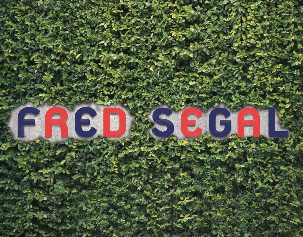
Current Fred Segal storefront.

Challenge
Update the Fred Segal logo and redesign brand materials and packaging.
Solution
Because Fred Segal is so rich in history, and so well known for the logo it has had for such a long time, it is important to take elements from the existing foundation instead of completely modernizing the brand in a typical way. The most defining feature of the original Fred Segal logo, the “E,” was a major consideration for picking the new logo’s typeface. Inspired by the unmistakable vine covered exterior walls of both Fred Segal stores, a pattern was created using the signature “E” that would mimic a vine. The pattern crawls up the sides of the boxes and bags just as the vines do, making them distinctly Fred Segal. The shopping bags which come in three sizes were inspired by 1960s bowling bags, referencing the decade the store was founded.